
Many shops online owners think that web design is all about looks and nothing else, which is not the case.
How your eCommerce store is designed also affects how it works, so its advisable that you look for the Best eCommerce Services. An effective E-store incorporates many aspects including conversion strategy, visual design, and technical engineering, for a smooth and straightforward shopping experience. So, your eCommerce design matters a lot. It won’t matter if you were running a small scale store or an enterprise-scale fully-fledged store; web design determines the success of your brand.
A poor design destroys user-friendliness and when customers have a hard time accessing your store, they are left with no choice but to abandon your store for a friendlier one. This will eventually drag sales, and you may end up shutting down your E-store. If you think about it, you wouldn’t even notice the design of a nicely designed E-store because you will easily find what you are looking for. A poorly designed one is noticeable from a mile away. It will give you a headache trying to navigate and find products, their description, and price.
Customers are not looking to be mesmerized by how colorful your store is, they want to find what they are looking, so that they can get back to their busy schedules. With that in mind, here are several eCommerce web design tips to help make your next eCommerce project a success.
Use simple and obvious navigation
Clarity is always better than clever. To help you create an efficient e-commerce store try to think about your visitors. The menu should be simple enough for your customers to make sense of what you are selling and at what price. Your page should have a clear product description and a few menu items to allow customers to navigate through though your website with ease. The navigation menu should also be where customers expect to find and not hidden. The best strategic place is at the top of the page and along the left side.
Make the search bar easy to find
If your store is a massive one with numerous items, it’s apparent that you are not going to fit all the products on one page. To counter this and still make your website design presentable, add a search bar, and the more products you have, the more critical the search becomes. Make it simple and avoid the small magnifying glass icon or mini search feature, and go for a prominent search box. The best strategic area to place your search bar is front and center for easier access. Get some inspiration from Amazon which sets its search bar at the top, in the center of the page, and completely obvious.
Make search filters simple
For larger stores with numerous products, make it easy for your visitors to find their products by allowing them to filter search results by color, size, brand, or any other option. You don’t want your visitors spending a lot of time trying to find what they are looking for just because you failed to include certain filters. What frustrates a customer most is when they can’t find what they are looking for. Just like a huge physical store, making countless walks through isles is tiresome. You should also give your visitors a way to change or undo the filter parameters.
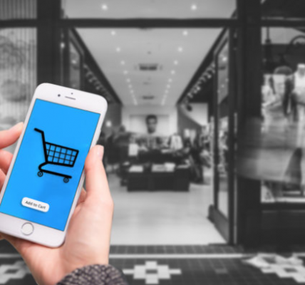
Make the cart easily accessible
The worst thing to do is make the shopping cart icon small and invisible. If this describes you, why did you create an e-commerce store in the first place? E-commerce stores are all about shopping carts, so make them visible as accessible. They should also be evident throughout the buying process. The perfect strategic place customers expect to find their shopping cart icon is at the top right of the page, so place it there for efficiency.
Move social media icons to the footer
Including social media buttons in your e-commerce website pages is important as it allows your customers to share what they have liked in your store. However, this should also be placed strategically. It would be shameful if your visitor stopped looking for products to purchase and go straight to Facebook. The best approach to prevent this is to avoid the social media icons in the sidebar and header and move them to the footer of the home page. This ensures that visitors are not tempted to click the social media button before completing a purchase.
Display products on one page
If it’s possible, display all your products on one page so that visitors to make it easier for visitors to find them. Try to select several products to be placed on the homepage. Don’t squeeze them if you are going to use images. The images should be clear enough for clients to identify the product. The wrong thing to do is limiting the number of products per page to a number like 8, especially when there are 100 products. The right thing to do is displaying either all products or give buyers options to choose from.
Final Sentiments
Running an e-commerce website is not as hard as what many people think. All you need is a good quality product that gives customers value for their money. The first thing that you should look into is the website design. To help you come up with effective and efficient web design is putting yourself in the client’s shoes. Focus on making their purchasing experience seamless and fun.


![Watch Video Now on xiaohongshu.com [以色列Elevatione perfectio X美容仪 perfectio X 全新仪器黑科技了解下]](https://www.techburgeon.com/wp-content/uploads/2019/07/perfectiox-singapore-150x150.jpg)